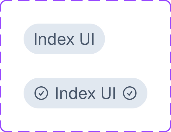
First release of index UI!
UI Components
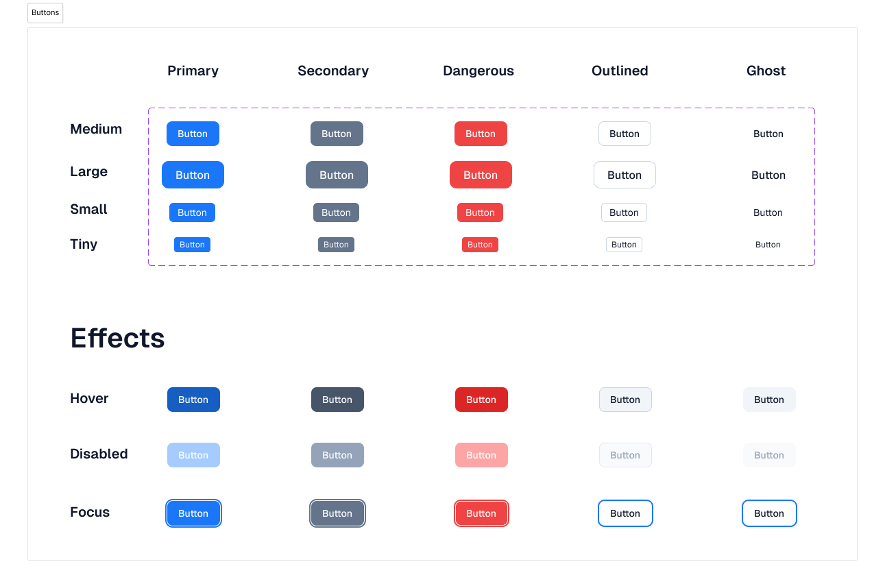
Buttons
- Variants: Primary, Secondary, Dangerous, Outlined, Ghost
- Sizes: Large, Medium, Small, Tiny
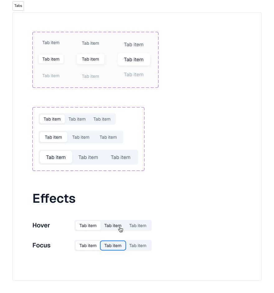
Tabs
- Sizes: Large, Medium, Small
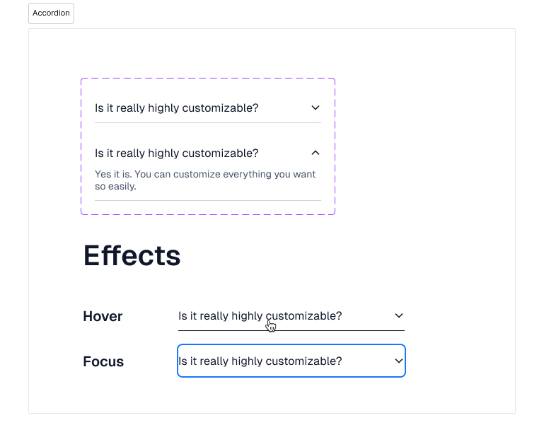
Accordion
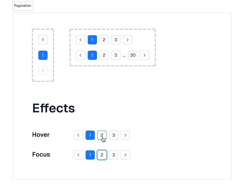
Pagination
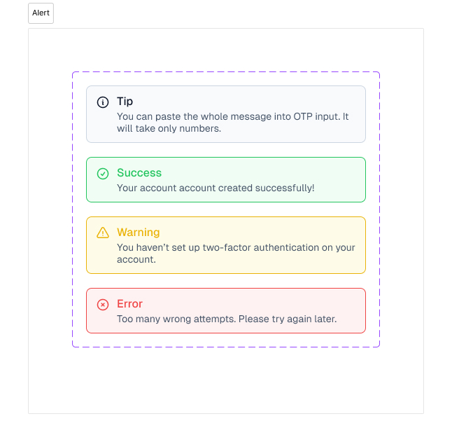
Alert
- Variants: Info, Succes, Warning, Error
Avatar
- Variants: Text, Icon, Image
- Sizes: Large, Medium, Small
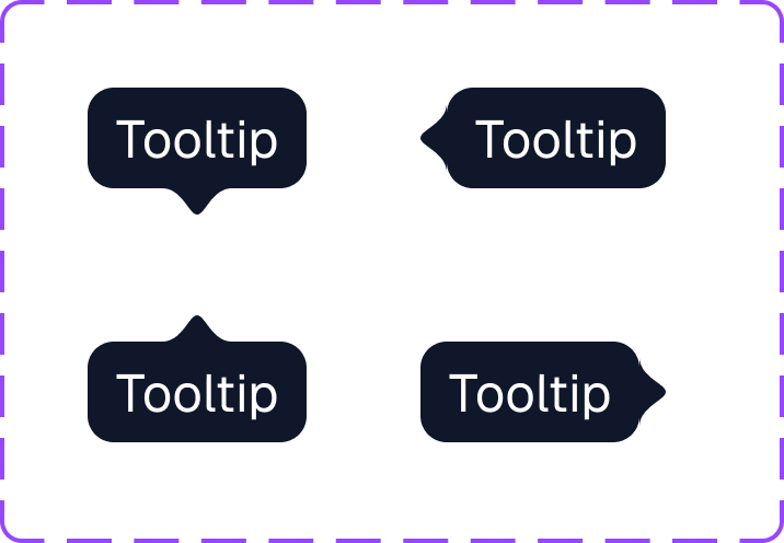
Tooltip
- Positions: Top, Left, Bottom, Right
Chip
- States: Default, Icons
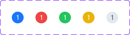
Badge
- Variants: Primary, Gree, Yellow, Gray
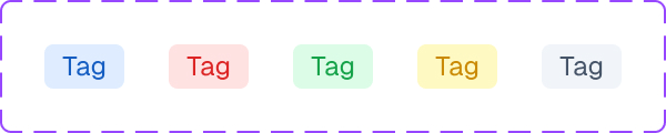
Tag
- Variants: Primary, Gree, Yellow, Gray
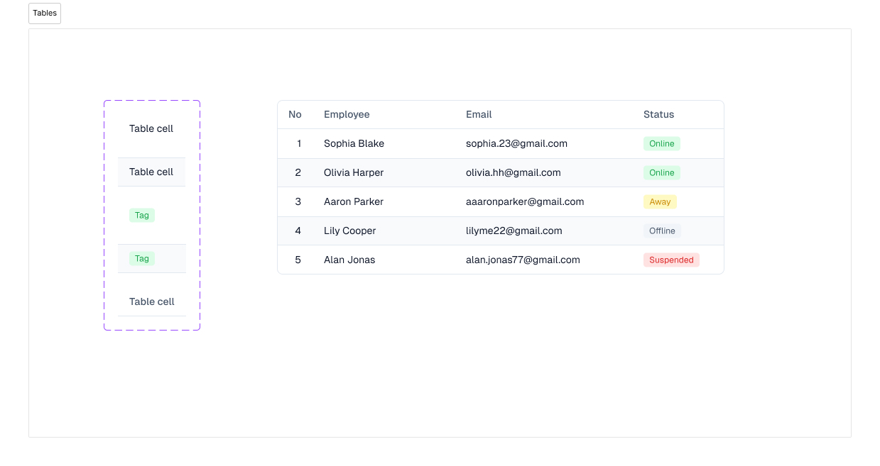
Table
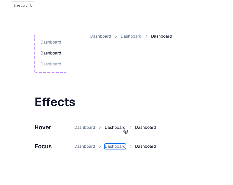
Breadcrumb
- States: Default, Active, Disabled
Dialog
Form Components
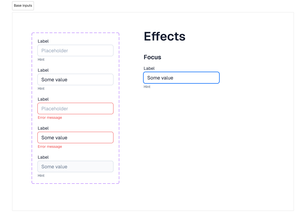
Base input
- States: Default, Error, Readonly
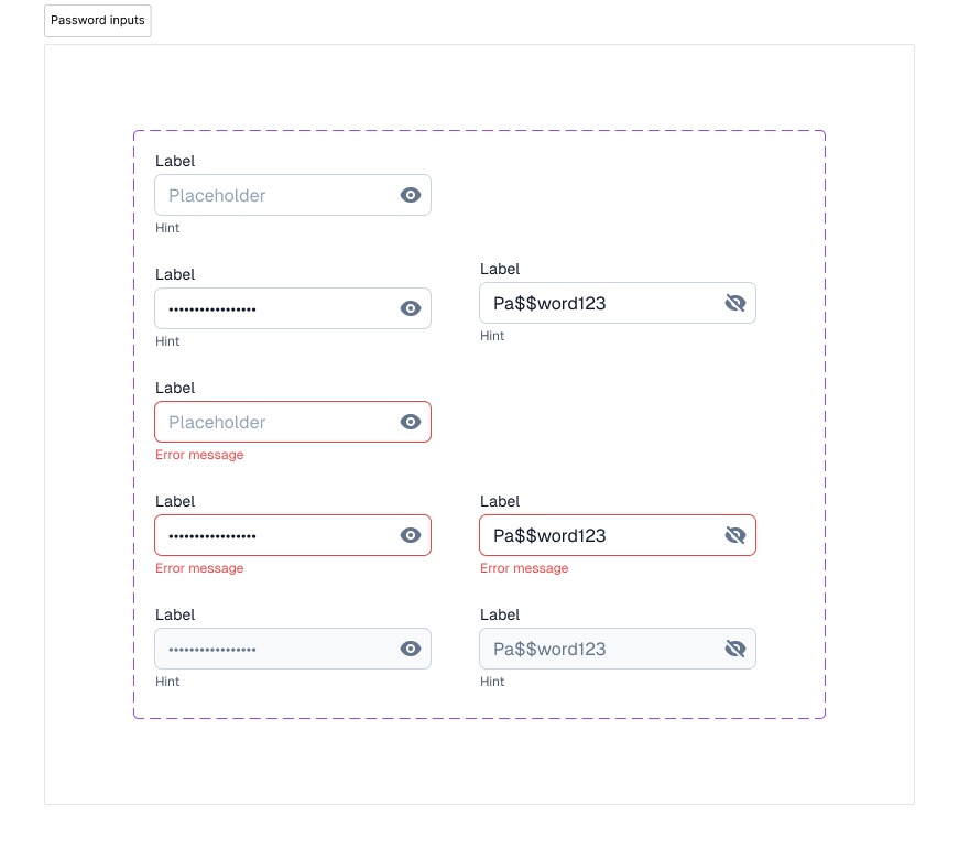
Password input
- States: Default, Error, Readonly
- Visibility: Visible, Hidden
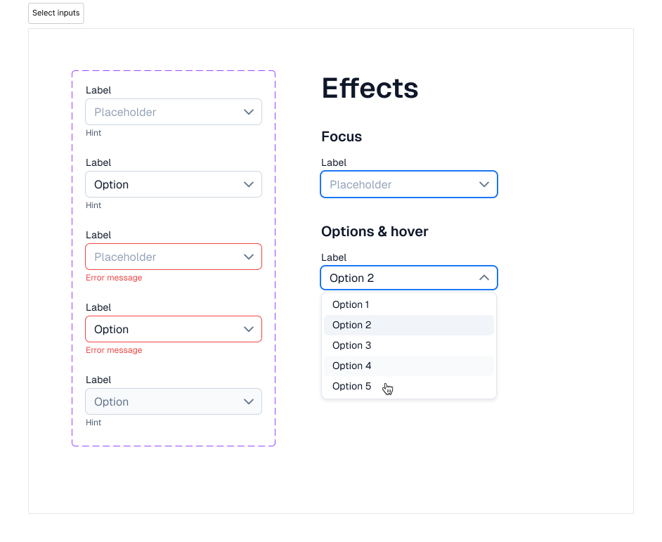
Select input
- States: Default, Error, Readonly
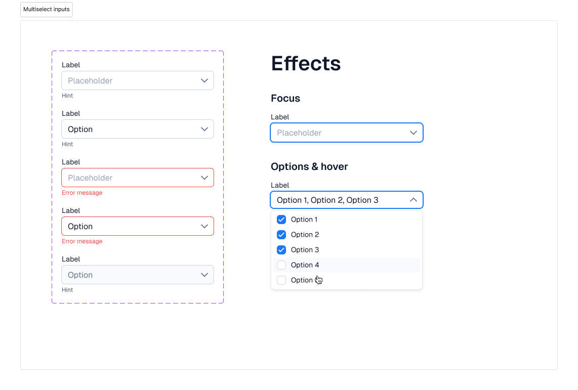
Multiselect input
- States: Default, Error, Readonly
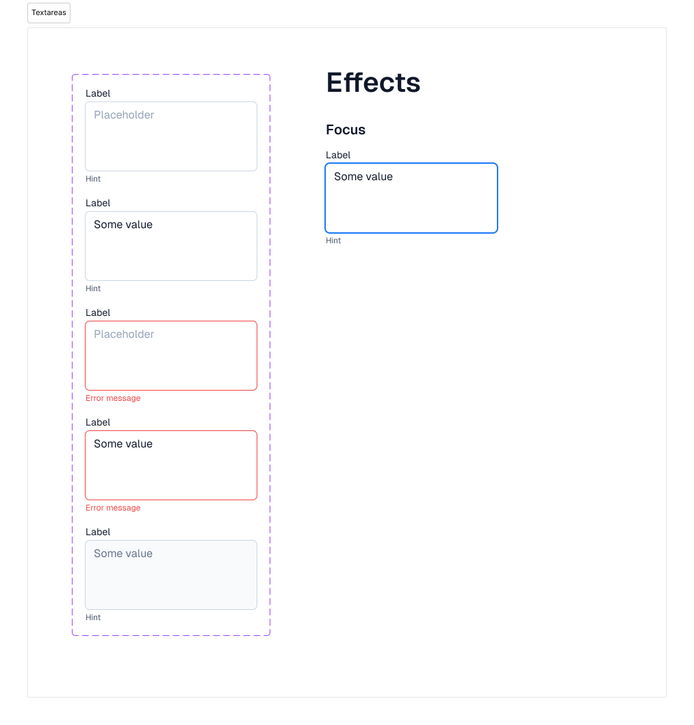
Textarea
- States: Default, Error, Readonly
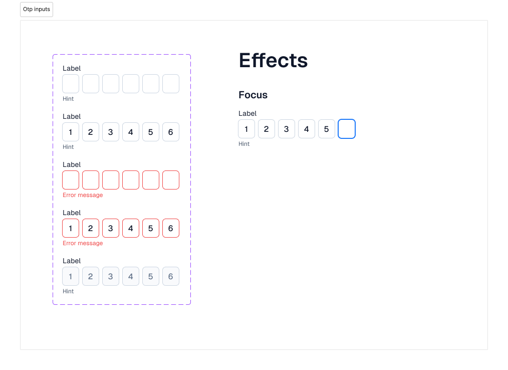
Otp input
- States: Default, Error, Readonly
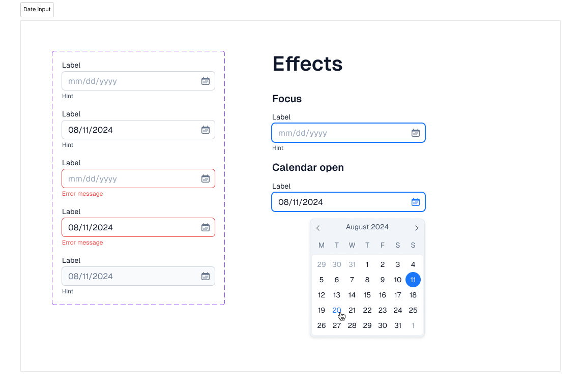
Date input
- States: Default, Error, Readonly
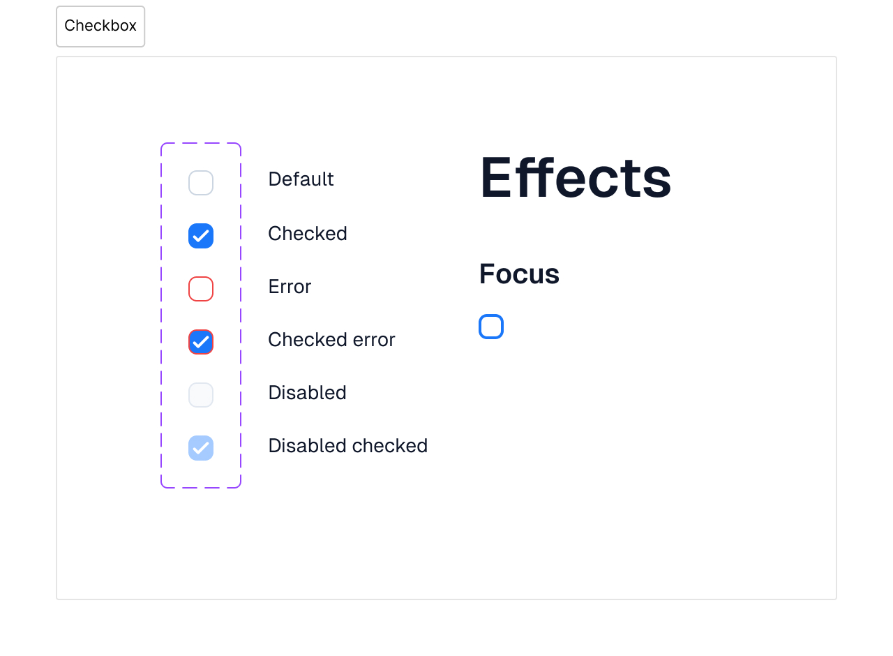
Checkbox
- States: Default, Checked, Error, Readonly
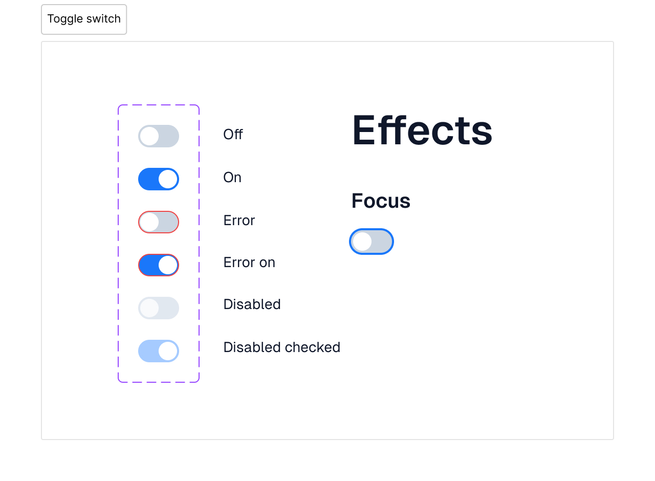
Toggle switch
- States: Off, On, Error, Readonly
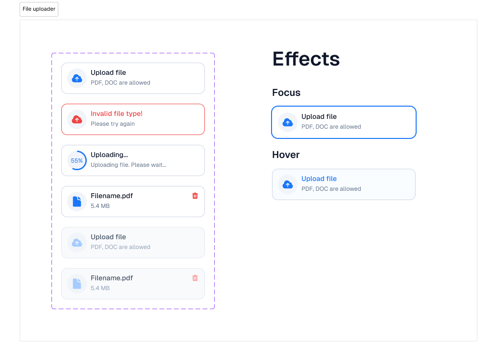
File uploader
- States: Default, Error, Uploading, Uploaded, Disabled